Design of Baseball Cube, a professional baseball analysis application
Client: SDE (Sports Data Evolution)
Project Date: 2021.12
Credit
UXUI: Heath Kim, Jeong-Hwan Shin
3D Visualization: Jeong-Hwan Shin
Design of Baseball Cube, a professional baseball analysis application
Client: SDE (Sports Data Evolution)
Project Date: 2021.12
Credit
UXUI: Heath Kim, Jeong-Hwan Shin
3D Visualization: Jeong-Hwan Shin

Background & Creative Direction
Background & Creative Direction
We proceeded with the design of Baseball Cube, a specialized baseball analysis application. We planned and visualized the overall aspects from branding to UX/UI and 3D graphics. The goal of this project was to process baseball tracking data systems into a format suitable for the app. Therefore, it was carried out through close collaboration with various analysts and developers. In addition, we actively introduced various software programs such as Adobe, Figma, and 3D for collaboration. Based on the design language 'technical', we mainly used dense lines like computer graphics and high-contrast colors.
We proceeded with the design of Baseball Cube, a specialized baseball analysis application. We planned and visualized the overall aspects from branding to UX/UI and 3D graphics. The goal of this project was to process baseball tracking data systems into a format suitable for the app. Therefore, it was carried out through close collaboration with various analysts and developers. In addition, we actively introduced various software programs such as Adobe, Figma, and 3D for collaboration. Based on the design language 'technical', we mainly used dense lines like computer graphics and high-contrast colors.


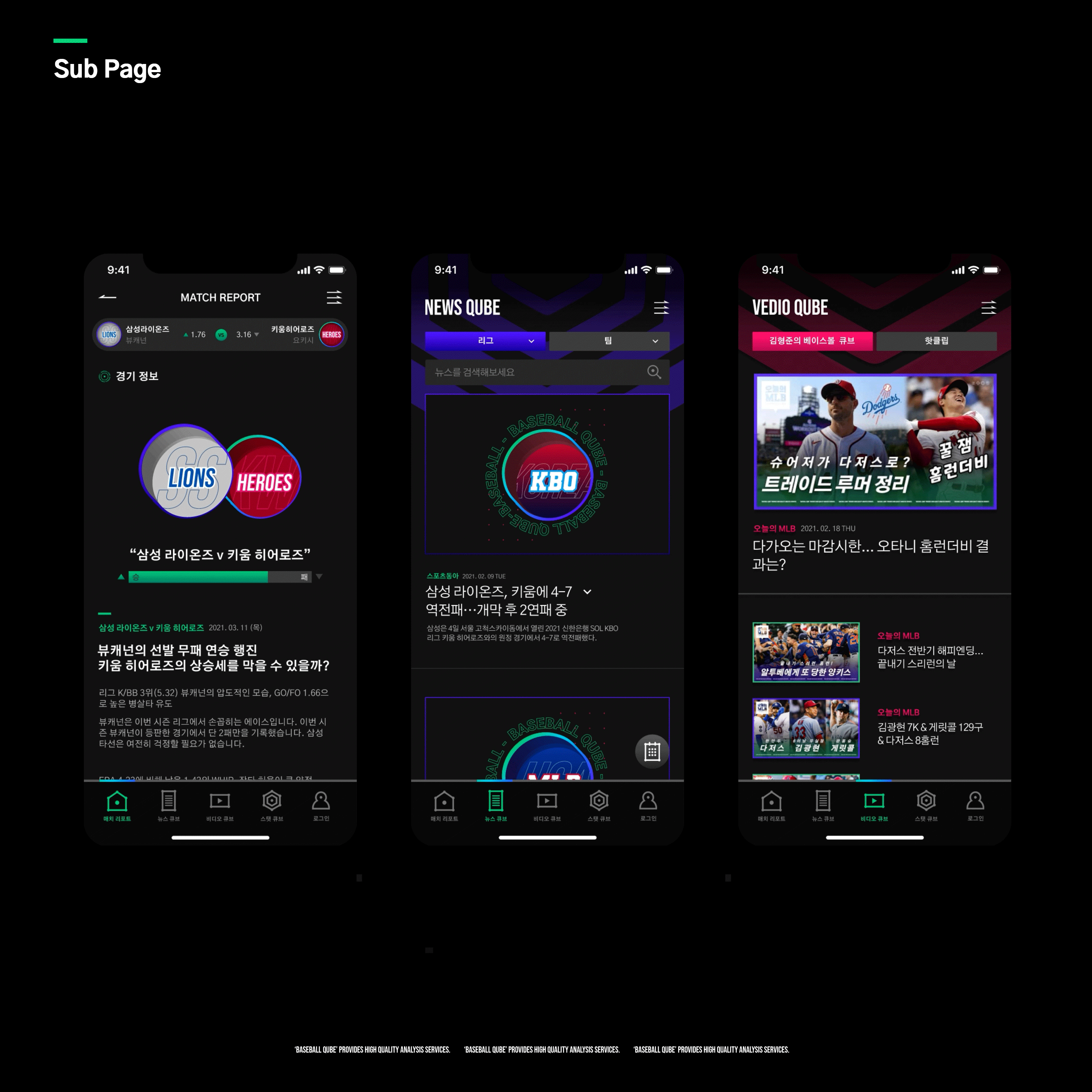
While using intense colors, I paid great attention to the proportion of dominant, sub, and accent colors to ensure that the core visuals stand out. Since the application contained many features, I structured the UI so that users can intuitively access the core functions.
While using intense colors, I paid great attention to the proportions of the dominant color, sub-color, and accent color to ensure the core visual stands out. Since it was an application with many features, I designed the UI so users can intuitively access the key functions.
While using strong colors, I paid great attention to the proportion of dominating colors, sub-colors, and accent colors to highlight the core visuals. Since it was an application with many functions, I organized the UI to intuitively access core functions.
While using intense colors, I paid great attention to the proportions of the dominant color, sub-color, and accent color to ensure the core visual stands out. Since it was an application with many features, I designed the UI so users can intuitively access the key functions.
While using strong colors, I paid great attention to the proportion of dominating colors, sub-colors, and accent colors to highlight the core visuals. Since it was an application with many functions, I organized the UI to intuitively access core functions.